
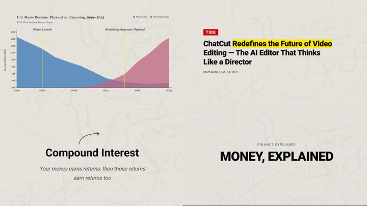
Featured design style
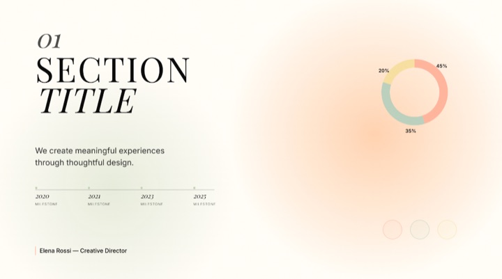
Light analytical editorial style built from warm gray paper surfaces, notebook and newsprint grids, serif editorial titles, Roboto utility text, math or data watermarks, poll cards, charts, and restrained highlights.
What this style controls
- Color system
- Named roles for backgrounds, text, accents, and surfaces, so every generated frame draws from one palette.
- Typography
- Display, body, and fallback font rules, with the size and weight relationships held constant across shots.
- Motion & layout
- Composition, spacing, entrance timing, and transition character — the part that makes separate clips feel like one piece.
- Reference frames
- Worked examples ChatCut reads before it composes something new in this style.
How ChatCut uses it
Pick this style once and it applies for the rest of the project: motion graphics, title cards, charts, and fully generated scenes all follow the same palette, type scale, and entrance timing. You describe what the shot should say — not what it should look like — and the look stays consistent even across clips you generate days apart.
Changelog
Published in the ChatCut design style library. No revisions yet.
Preview
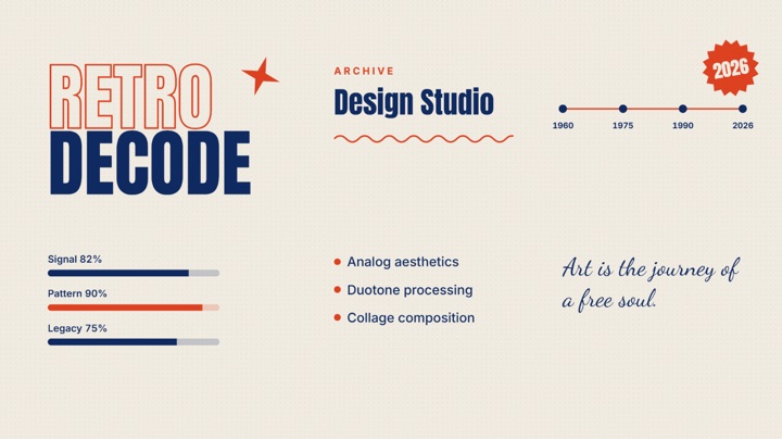
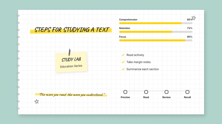
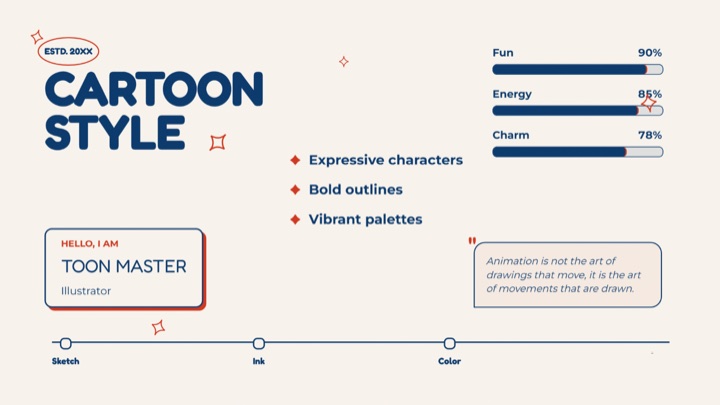
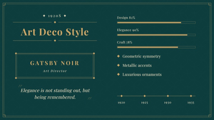
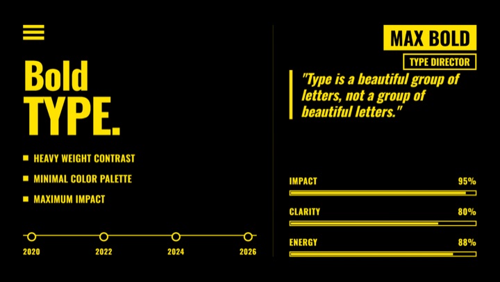
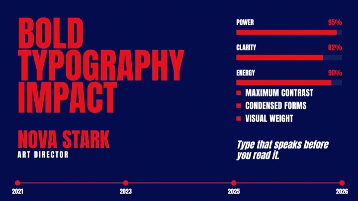
16:9 composition 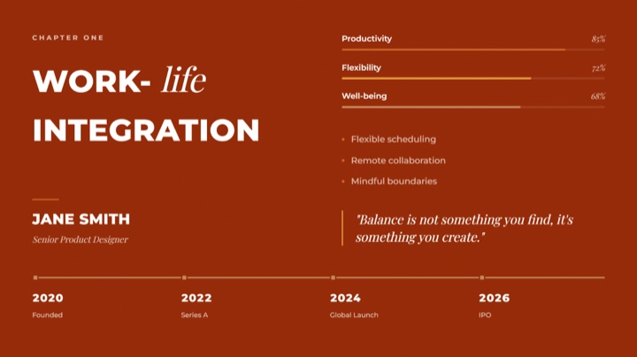
Commenting is not open yet. Until it is, tell us how you use this style in Discord.