
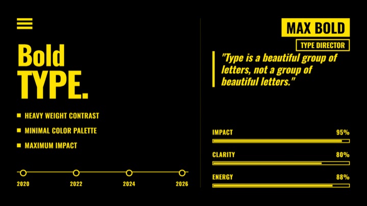
Featured design style
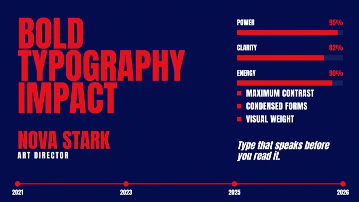
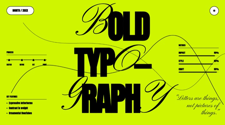
Two-color high-contrast typography style built from pure black canvas, bright yellow text and accents, oversized Oswald titles, simple bars, bold bullets, and direct hard-cut composition.
What this style controls
- Color system
- Named roles for backgrounds, text, accents, and surfaces, so every generated frame draws from one palette.
- Typography
- Display, body, and fallback font rules, with the size and weight relationships held constant across shots.
- Motion & layout
- Composition, spacing, entrance timing, and transition character — the part that makes separate clips feel like one piece.
- Reference frames
- Worked examples ChatCut reads before it composes something new in this style.
How ChatCut uses it
Pick this style once and it applies for the rest of the project: motion graphics, title cards, charts, and fully generated scenes all follow the same palette, type scale, and entrance timing. You describe what the shot should say — not what it should look like — and the look stays consistent even across clips you generate days apart.
Changelog
Published in the ChatCut design style library. No revisions yet.
Preview
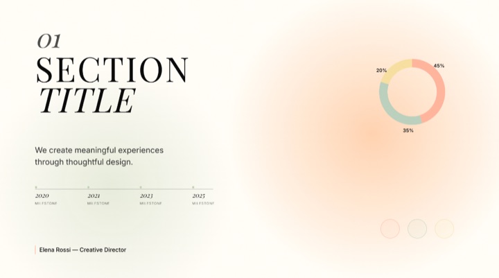
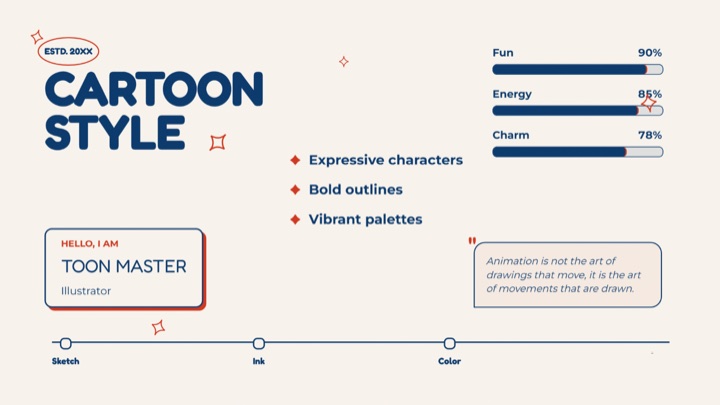
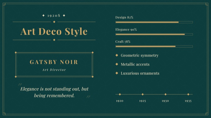
16:9 composition 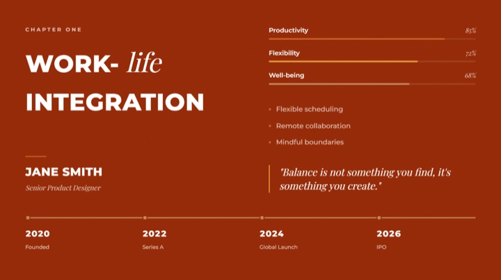
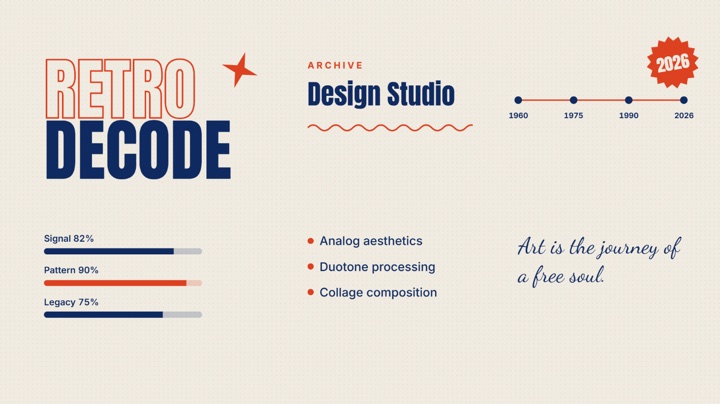
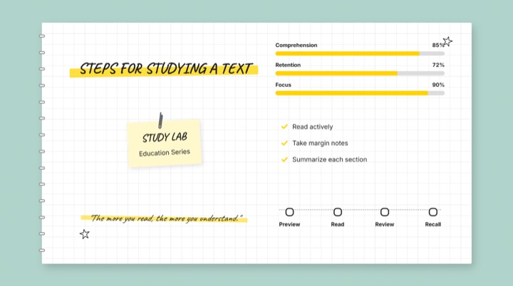
Commenting is not open yet. Until it is, tell us how you use this style in Discord.